Dev Log 6: New Environment Renderer
Hi guys,
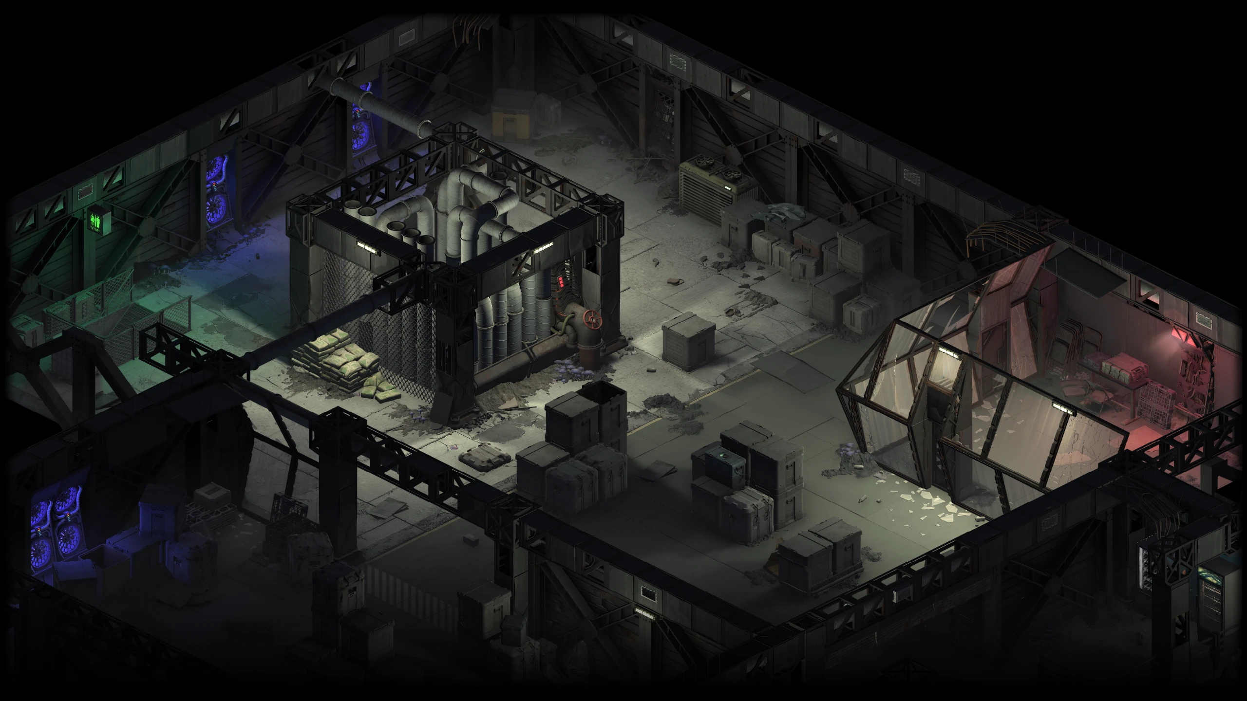
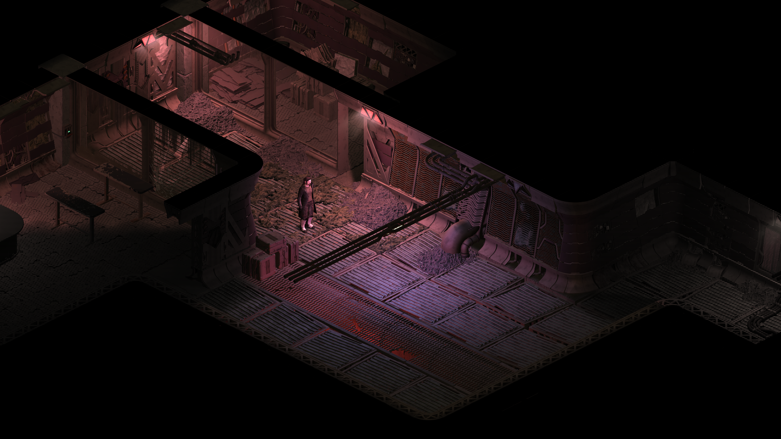
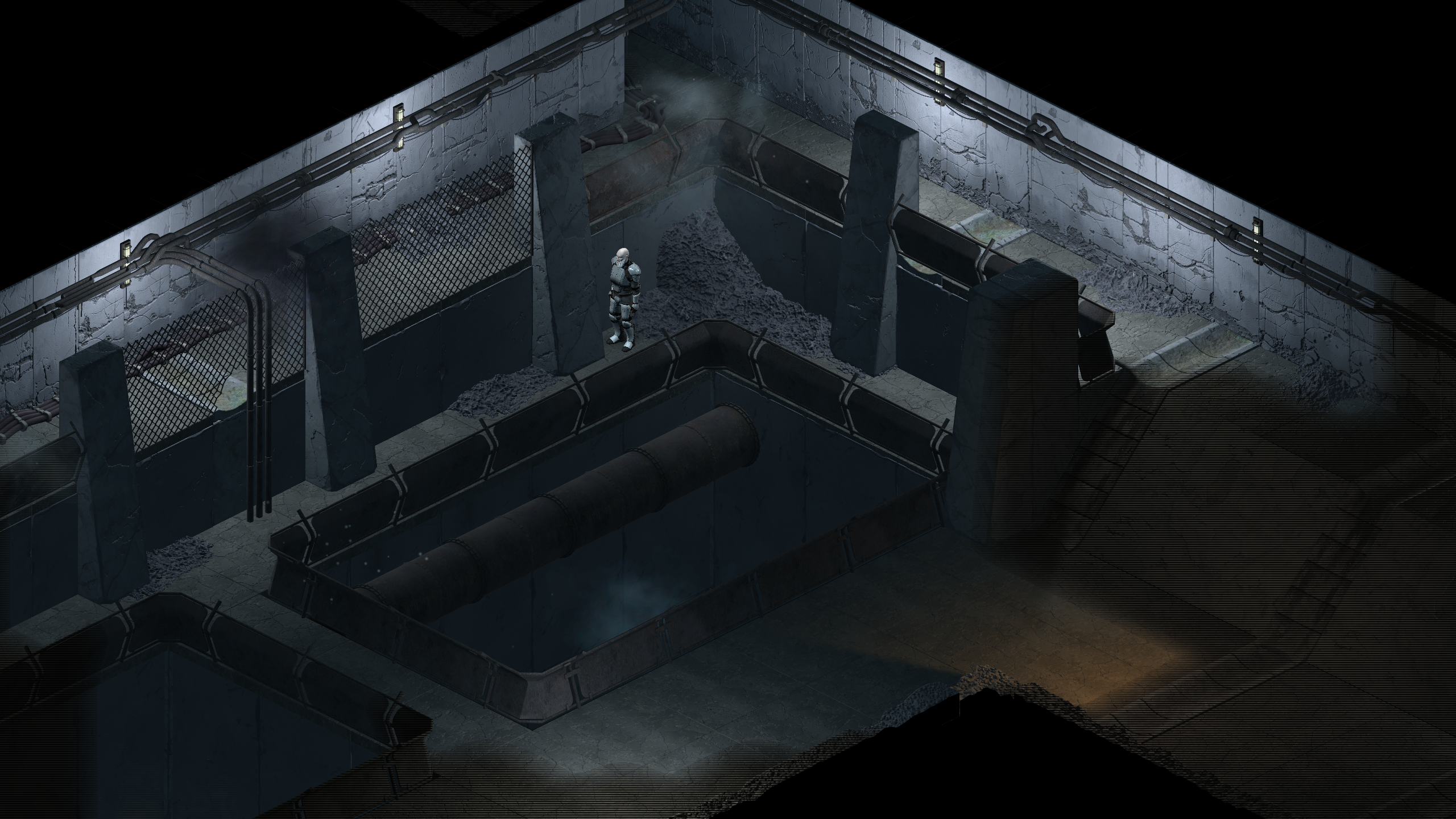
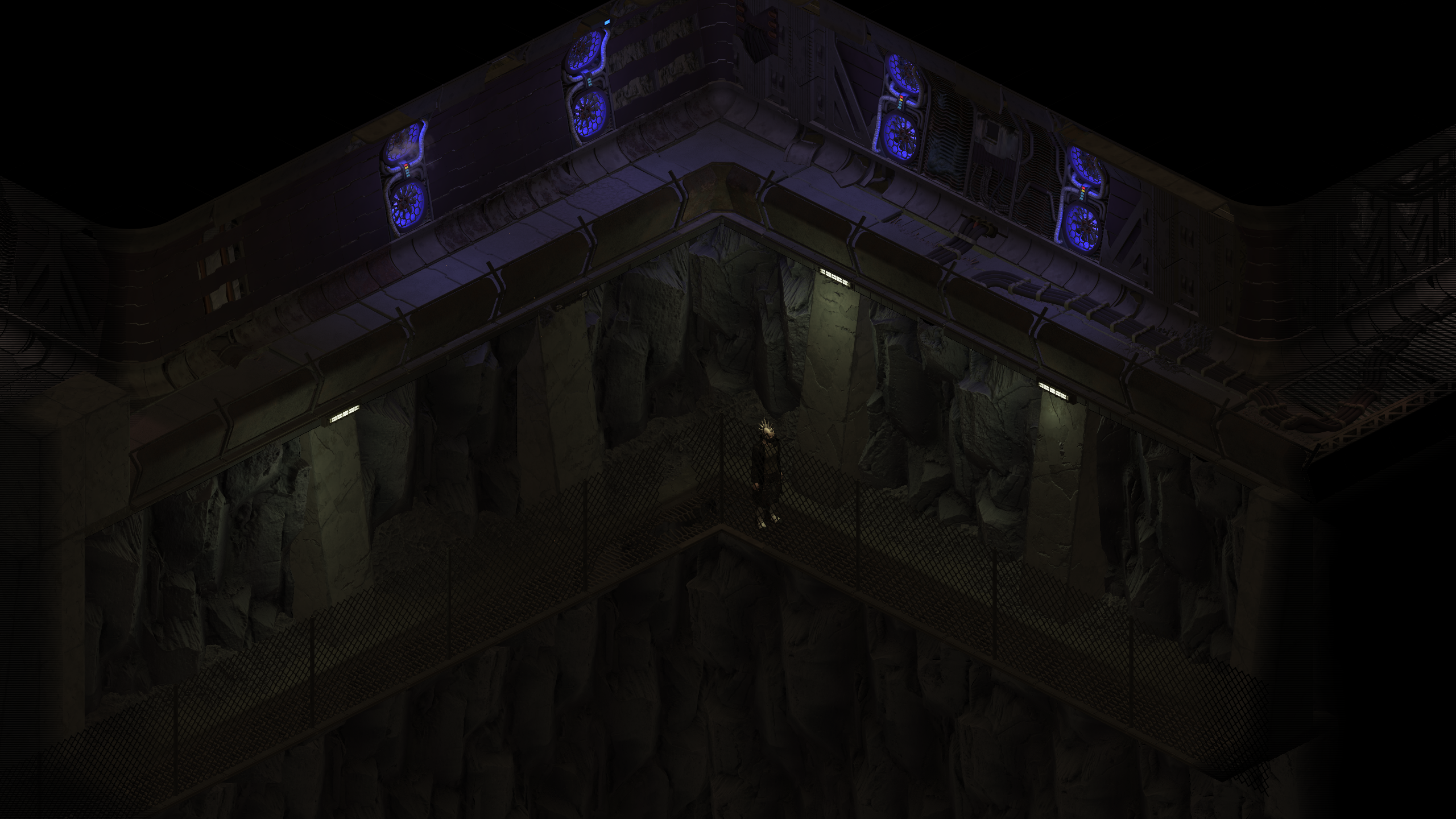
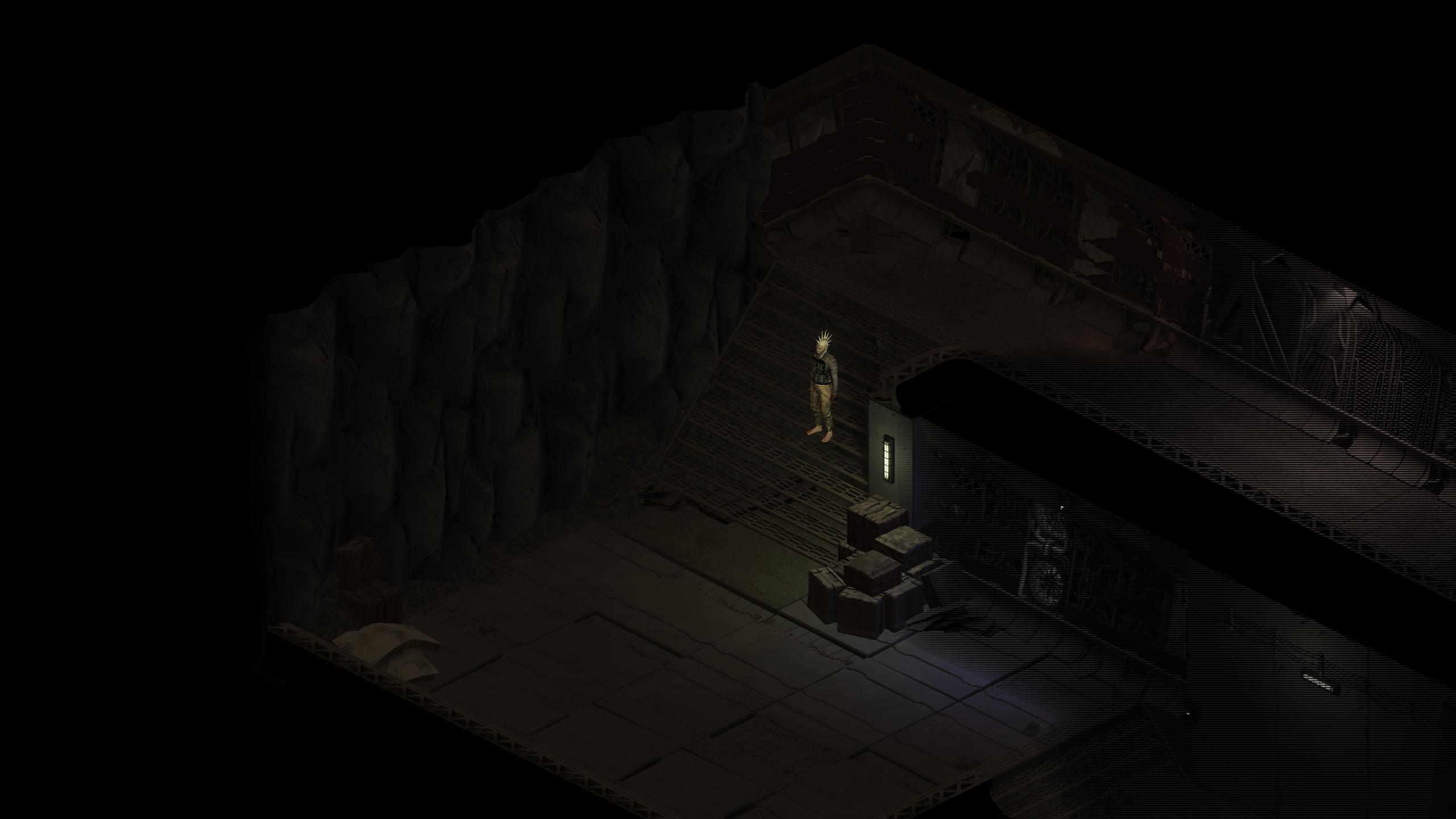
We're finally ready to give you a sneak peak in the new and improved Infusion environment visuals. We've done extensive work on the 2D rendering engine, and while there are still things to improve, we're quite pleased how it looks now. Keep in mind, though, that all the scenes you'll see below were made for demo purposes only and do not reflect how the actual game levels will look.
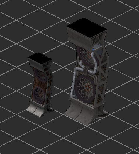
First thing we did is increasing the asset resolution significantly. We increased the size of the base tile from 96x48 to 160x80, which resulted in the asset size change you can see below.
Next, for all our prerendered graphics we're also exporting normal and height maps, which allows us to have smoother lighting, but, more importantly, it enables objects to clip through each other. This solves so many problems with sprite ordering and also allows us to easily combine items into interesting environmental compositions.

Another important thing that we introduced is actual tile height and sloping, so we no longer have to simulate it with assets that are otherwise logically flat - which used to result in weird discovery and lighting artifacts. This will allow us create more interesting maps, as well as have gameplay mechanics that relate to height (such as falling down, climbing, in-area elevators, etc). We're also going to have to adjust many existing mechanics to take elevation into account, but that's a story for another dev log.
We've also improved how shroud and fog of war works. It's now much smoother and will no longer leave weird gaps in the map while it's partially discovered as often happens in the old game.
There's still much work to be done with the rendering engine - fluids, decals, creature shadows, post-processing effects, and also many minor tweaks, so stay tuned for more updates. Once we get a bit more assets done, we're going to make a video to show you how the engine looks in motion. In the meantime, let us know how you like the new visuals.
Cheers.


